Case Study
Visual Identity for BeEco
Transform the negative perception of second-hand consumption into an aspirational and responsible decision through a vibrant and modern design.
Project Overview
The main challenge with BeEco's branding and design was to demystify second-hand clothing. Historically, in many contexts, buying used clothing was surrounded by negative connotations regarding hygiene or quality. Thus, the main objective of this branding work was not only to create a friendly logo, but to structure a premium quality visual identity capable of elevating this sustainable fashion brand to the category of an aspirational boutique.
Through the deep development of a brand manual, exploring every detail of ecological packaging, colorimetry, and the company's tone of voice, we managed to formulate a graphic design proposal that invites modern consumers to join the circular economy, driven by both aesthetics and ethical conviction.
BeEco - Sustainable Fashion
2025
Branding, Logotype, Brand Manual, Visual Strategy
BeEco's Purpose
In an era marked by the urgency of climate change, the excessive consumption of the fashion industry (also known as fast fashion) has positioned itself as one of the most environmentally damaging sectors. The excessive use of water in cotton garment production, chemical pollution from industrial dyes, and the accumulation of tons of textile waste in landfills are problems that have led brands and consumers to rethink the impact of what happens inside their closets.
BeEco is a fictitious sustainable fashion brand born with a highly defined social and environmental purpose: to give a second life to garments and actively encourage a much more conscious consumption model among young and modern buyers. This brand is a conceptual case study developed to explore best practices within the design of visual identity in circular fashion.
The brand addresses a complex duality: on the one hand, the undeniable environmental impact, and on the other, the still latent negative perception of second-hand clothing that, for decades, was associated with low quality, obsolescence, and even a lack of hygiene. BeEco seeks to radically alter this perception to turn vintage and circular fashion into a genuinely aspirational and elegant choice.
The DNA of a Sustainable Brand
The central postulate upon which the entire aesthetic of this project is built is: "Fashion must be conscious". From this principle, the brand's development demanded the creation of a graphic universe that simultaneously projected boutique quality standards (desirable fashion) with the unavoidable attribute of responsible consumption. BeEco is not a disorganized donation warehouse; it is a careful curation of textile pieces.
To guarantee graphic cohesion, cardinal values were defined to dictate the palette, typography, and visual signs:
- Sustainability: The guiding pillar. Promoting an ecosystem and an economy that reduces the textile carbon footprint.
- Care: Evidencing care both in the restoration and selection of garments, as well as in the delicate packaging and delivery to the final consumer.
- Authenticity: Maintaining deep communicative transparency about the provenance of clothing items, genuinely connecting with the ethical ideals of its buyers.
Naming and Imagotype: Why the bee?
The brand's verbal system began with the strategic phoneme of the name. BeEco is no accident; it's an agile and effective English wordplay between the verb "to be" and the noun "bee", connected with the word "eco" (ecological). Phonetically, it invites us to "be ecological" while building a powerful mental evocation linked to nature.
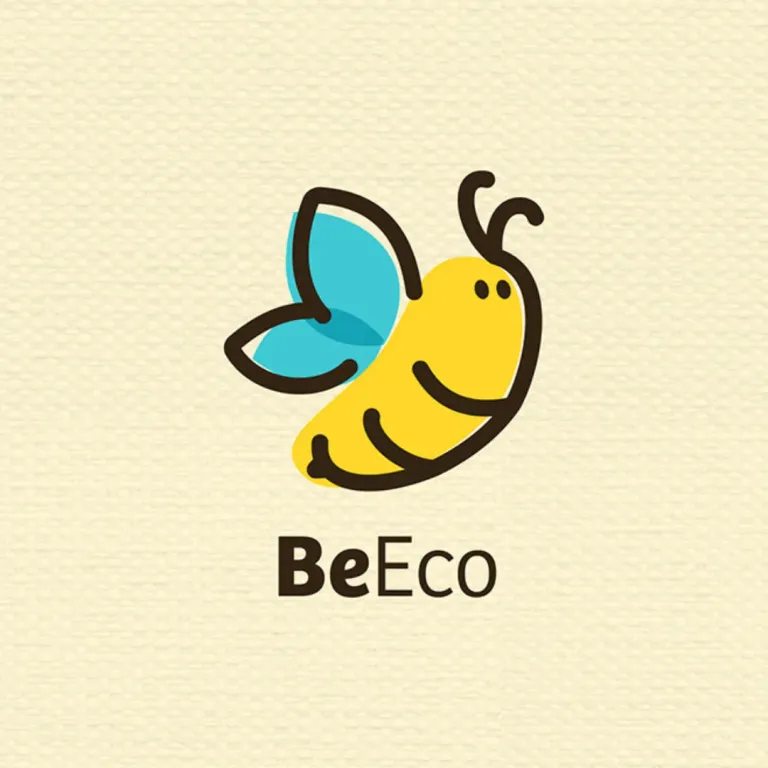
That is why the central element of its visual identity and imagotype revolves around the geometric figure of a bee. In nature, bees are key pollinating agents and an indisputable symbol of ecological balance, collective work, and earth ecosystem preservation.
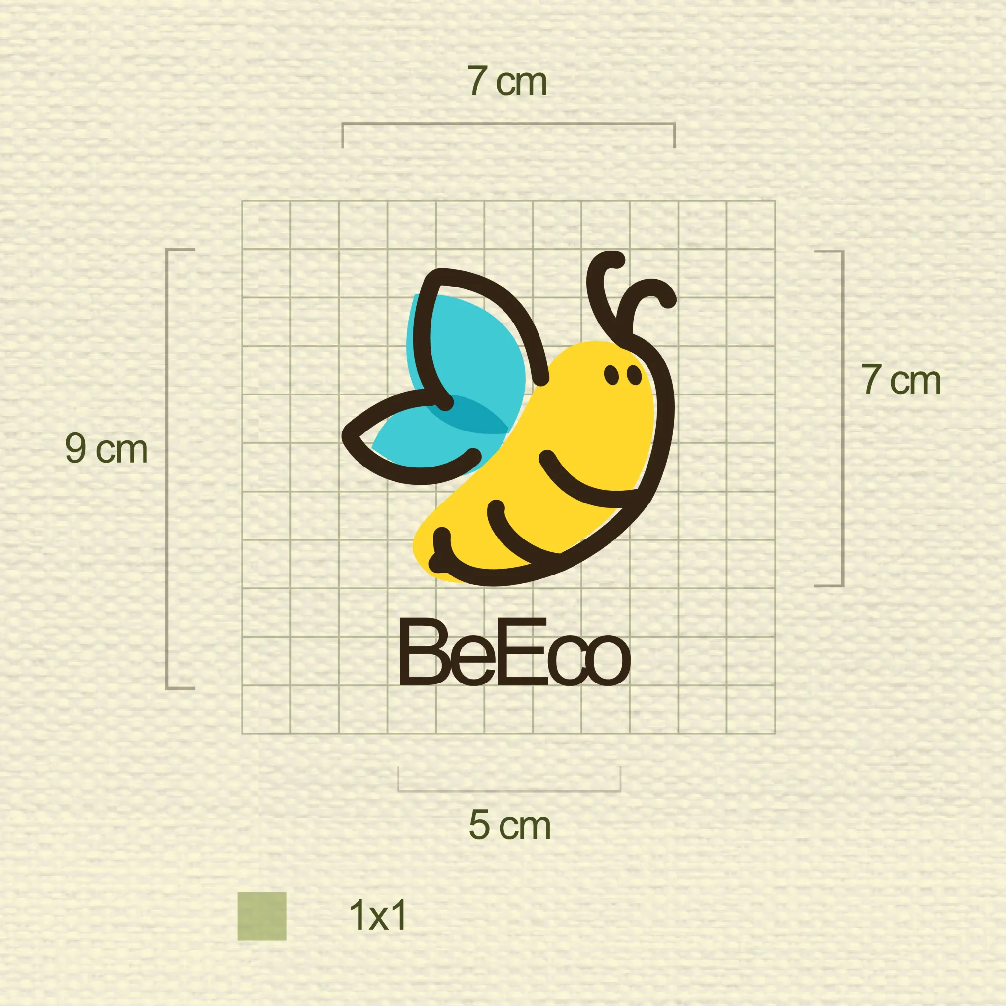
The development of the ecological fashion logo runs away from hyper-realistic or oversaturated elements. It was built according to grid theory to ensure stable and proportional relationships. The result is a linear isotype, asymmetrical in certain dynamics, but organic and friendly; a versatile symbol that allows fast reading in digital micro-formats (such as Instagram avatars or tags in social buttons) as well as its natural reduction or enlargement in packaging and large-format printing.
Color Palette and Typographic Selection
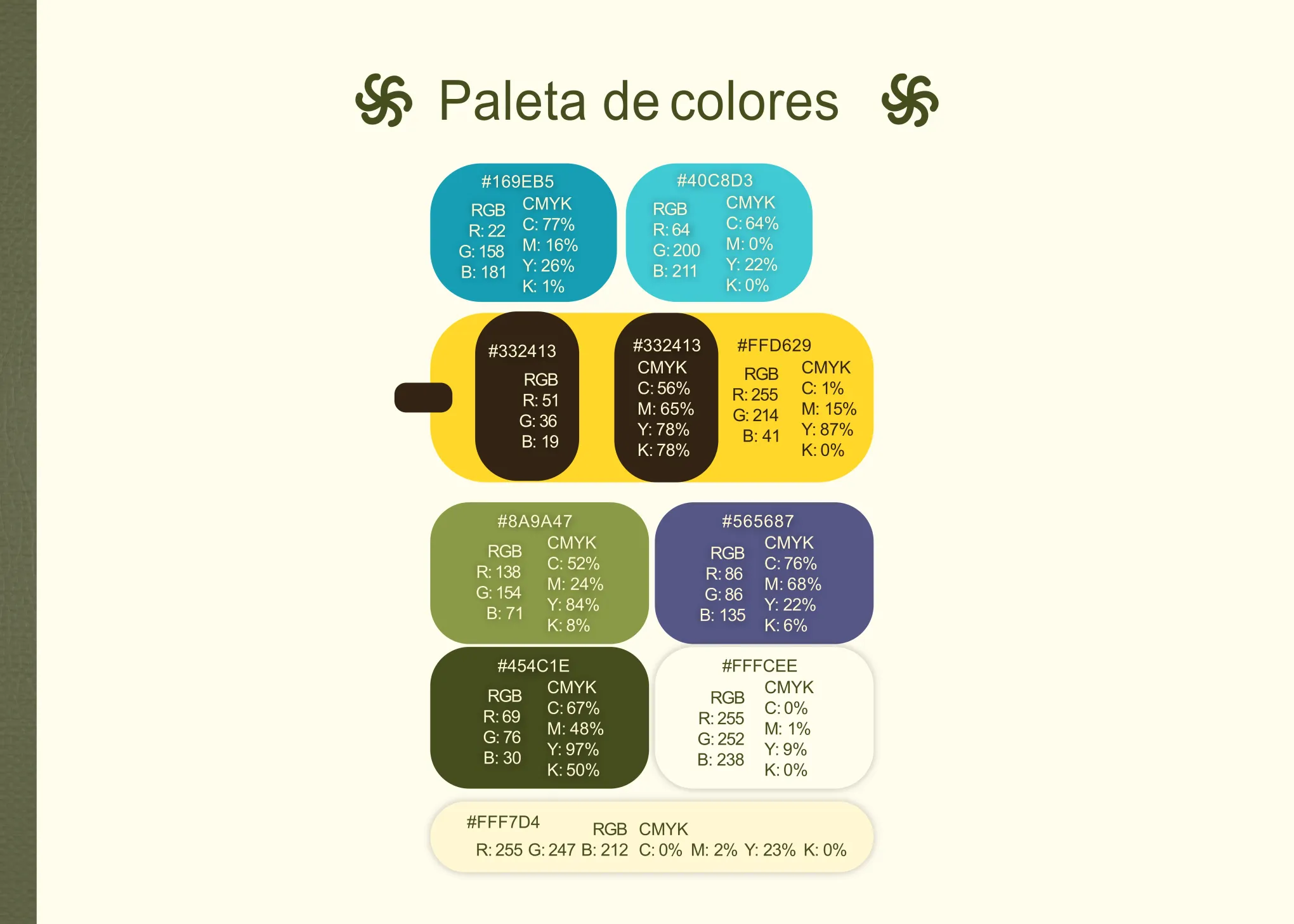
An eco-sustainable brand occasionally falls into the dreaded "greenwashing" of using flat, saturated, or generic greens. For BeEco's chromatic universe, we opted for desaturated colors that are highly organic and extracted from natural panoramas.
The brand's weight falls on a balanced blue and bee yellow. The soft yellow immediately evokes pollen, vital energy, or natural biological illumination; on the other hand, the blue and a grayish-green work to generate trust, serenity, and clean inspections, vital qualities for selling previously used clothing. Additionally, the Identity Manual contemplates a secondary palette of sand and neutral tones perfect for bringing balance or the warmth of raw cotton as a background color without causing distortion.
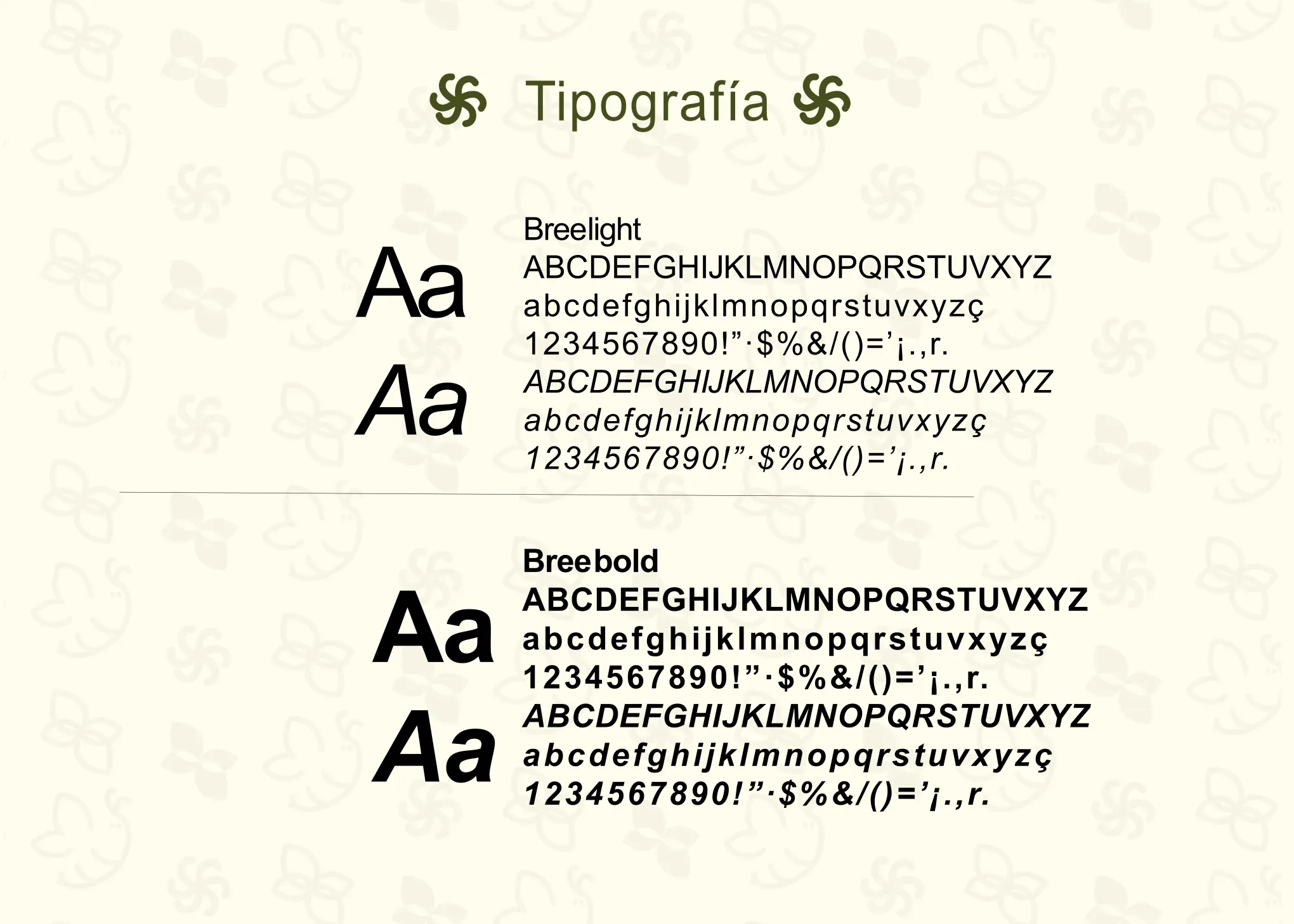
Typographically, the brand manual implements the Bree family. It is a sans-serif family originally conceived with clearly humanist attributes. The lowercase letters have warm stems, round shapes, and gentle contours, perfect for a brand that wants to position itself as "friendly." The high legibility of Bree makes it an ideal candidate for both large letterings and the lengthy paragraphs of descriptive tags for reused materials.
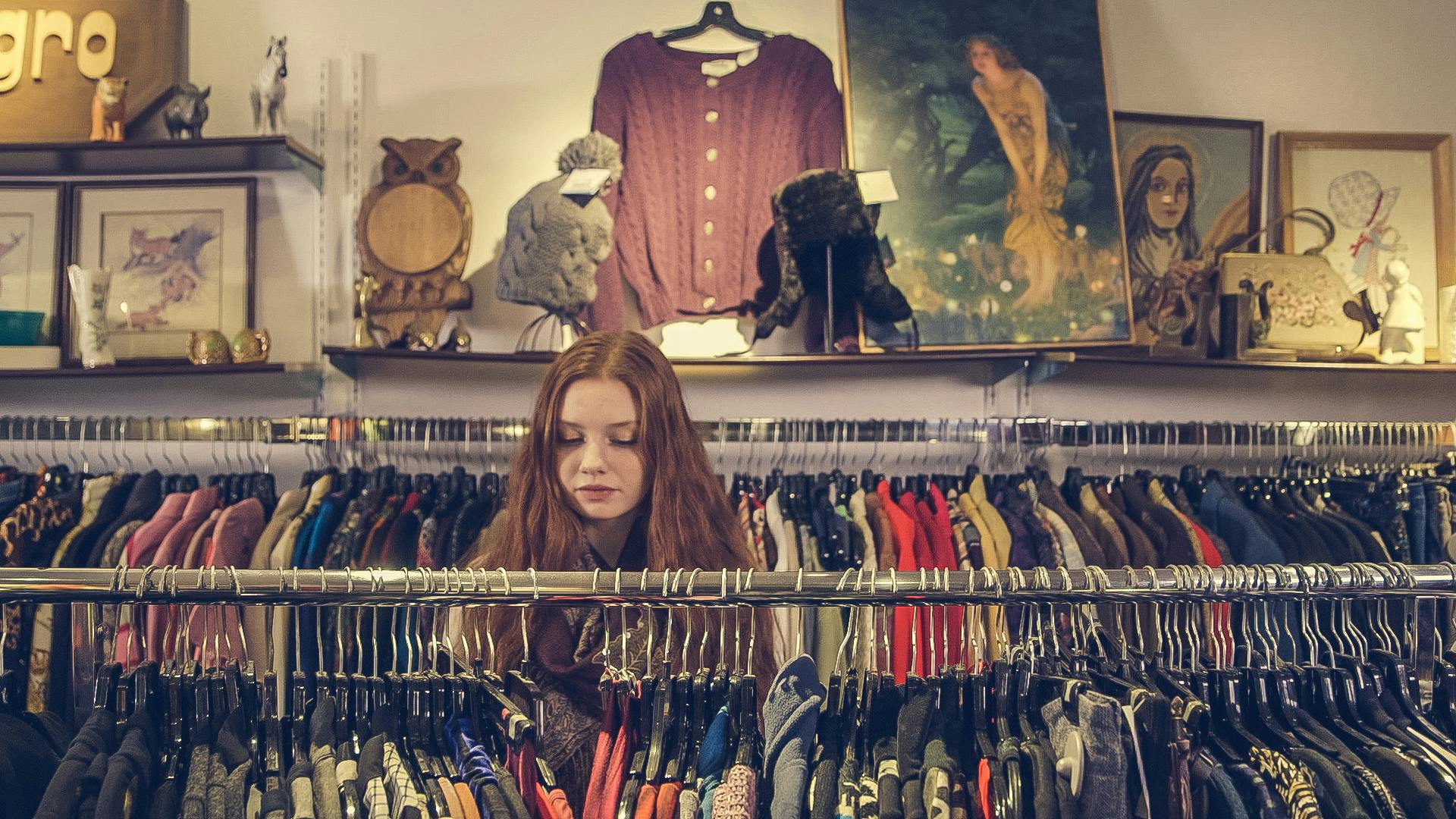
Sustainable Packaging and Shopping Experience
Developing a corporate identity that preaches circular economy required going far beyond the digital environment, affecting the logistics and presentation of the material. The sustainable packaging could not immediately turn into useless trash for the buyer. For this reason, modular recycled material of artisanal aesthetics was designed, where the bee stamp intervenes as a golden certification.
Upon opening the vintage clothing box, the "unboxing" experience reaffirms the curator's dedication and cleanliness with the garment and with mother earth. Tags created with plantable seeds and instructions on how to care for (and repair) the fabric before throwing it away crown the visual communication of the entire project.
BeEco, in conclusion, vividly illustrates how an advertising strategy agency can use all the languages of design (color psychology, textual architecture, iconographic symbolism, and haptic experience) to refute the hesitations towards second-hand culture and pave the way towards the revolution of circular fashion and sustainable clothing.

Discover all the technical details
The complete brand manual is available on my Behance portfolio.